Categories
photography Victorian

Carte de Visite

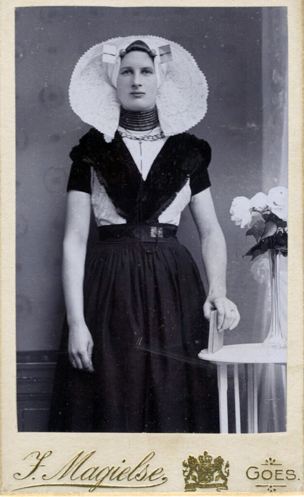
Or Visiting Cards to you and me. Popular from the 1860s they were mostly replaced by cabinet cards in the 1870s and onwards. CDVs were smaller than the later cabinet cards so could easily be given as visiting cards. They were cheap to produce, hence a person could have a photo taken in a studio and then have multiple reproductions made. There was a mania for collecting CDVs and albums were produced for collections to be stored.
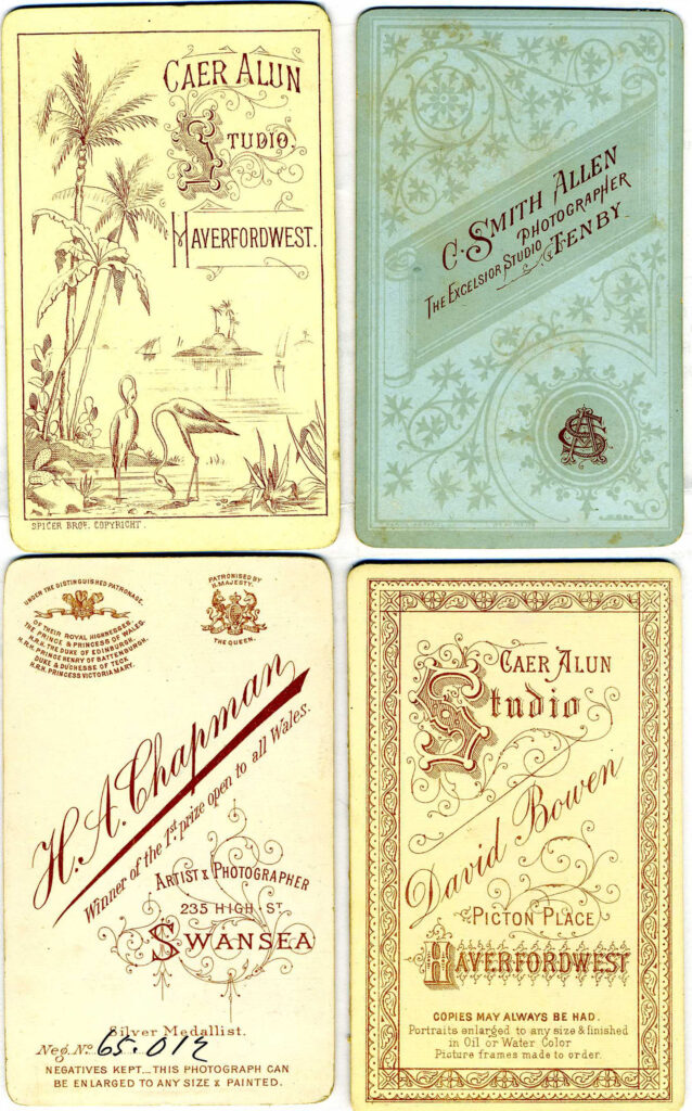
Often the elaborate backs of CDVs can be more interesting than the photographs themselves.
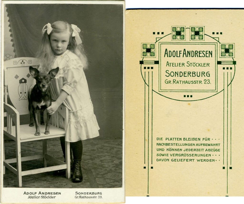
Look past the girl and the dog and you can see that the chair has a jugenstil design and the reverse of the card is clearly influenced by art nouveau.
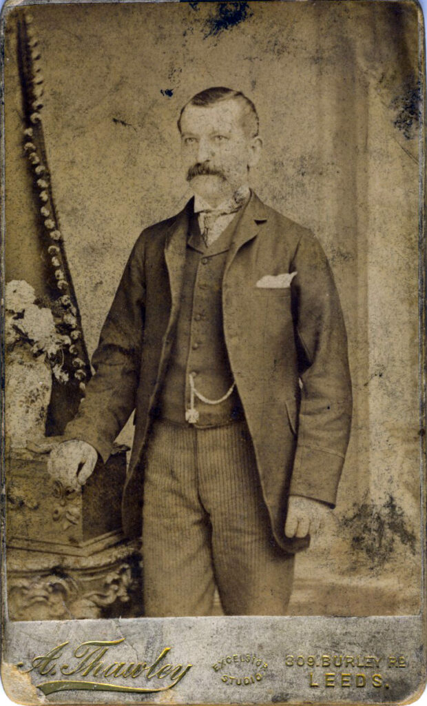
I’m not sure many of the CDV portraits did justice to their subjects. Many men in particular come out looking stern and rigid. (They had to stay very still for exposures so this goes some way to explaining why they come out the way they do).

CDVs were also used to illustrate national costumes and what were then referred to as “racial types,” a topic perhaps for another discussion. The Dutch lady at the head of this post is a good example of national costume.

[All these CDVs are from my personal collection]
Categories
photography

How it all began

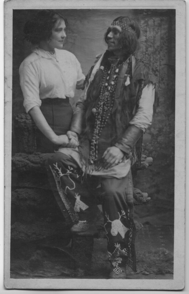
It’s going back some years now but finding this photograph got me interested in collecting old photos in the first place. Like many people I had some topographical postcards but this was the first time I started thinking about the social history to be explored in old photographs and real photographic postcards (RPCCs).

I found it in a box of old photos at a table-top sale in the Community Centre, Cromford, Derbyshire. It was with a bunch of other unrelated photos and postcards at a stall selling general bric-a-brac and antiques. There’s nothing to identify who it is or where it comes from and it’s a real photograph, not a postcard. There’s no studio name on it either. So it’s all a mystery still even though other people have tried to find out more about it.

Looking again at the man’s outfit it doesn’t seem very authentic. Her clothes probably place the time as somewhere in the Edwardian era. The backdrop says it’s a studio but why would the man dress up like this? Was it for a play or theatre review or was he with a visiting “Wild West” show though these were more popular in the late Victorian era?

It’s unlikely I’ll ever know the true story but if you have any ideas then do contact me.

Categories
photography

My favourite old photograph

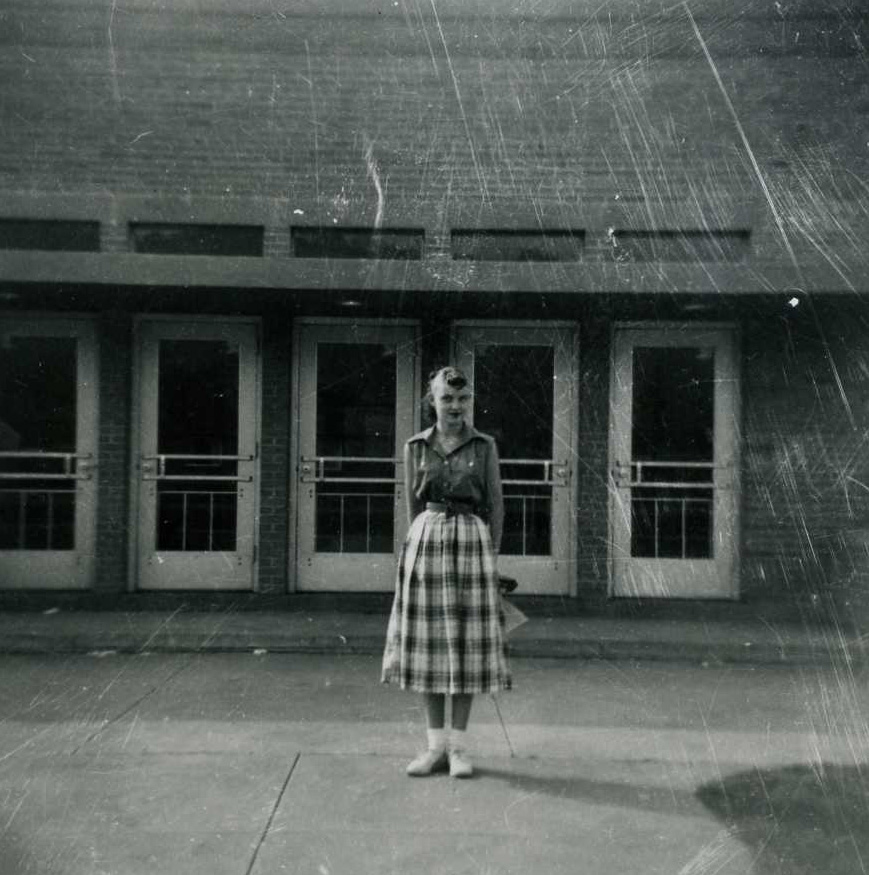
Having a favourite photograph, old or new, is as absurd as having a favourite film or book. The item at the top of the list is likely to change from day to day, month to month, year to year. However this photograph has consistently been a favourite of mine.

Why? Because it’s mysterious and spooky and the atmosphere is made partly by the scratches and blemishes. What’s the girl smiling at and what does she have behind her back? It could easily be a still from a David Lynch film (Lynch would also be top of my favourite directors).

The photograph is bound inside a small generic cover with five other photographs, each 8cm by 8cm. On the reverse of the cover it shows “Processed by Rothgeb* Photo Service of Youngstown Ohio” who are apparently a member of the Master Photo Dealers and Finishers Association.

(*Rothgeb sounds like one of the Ancient Ones from an H P Lovecraft story doesn’t it).

Categories
photography

Painting with Light

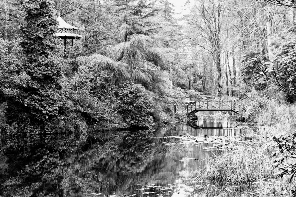
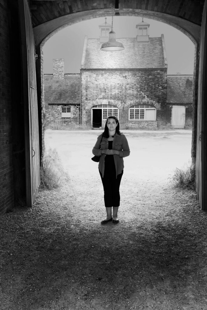
Although I originally called my blog Where the Darkness Begins, to reflect the often dark themes of my writing, this revised blog is mostly about photography, which is nothing more than painting with light. The example above was taken at Portmeirion. On flickr I most often post photographs from my ever-growing collection of old photographs rather than my own work. No wonder then that I prefer to work in black and white rather than colour. (That’s not to say I don’t do colour work too).

For me there’s something much more mysterious and dreamlike about black and white photography than there is with colour photography. The fact that you are painting with light is made all the more obvious in monochrome. I also find that I am more inclined to make actual prints of monochrome photos than I am of colour photos. This is especially true when it comes to A3 prints where a good print will yield far more detail than can be seen in most colour prints and certainly more detail than can be seen on a computer screen.

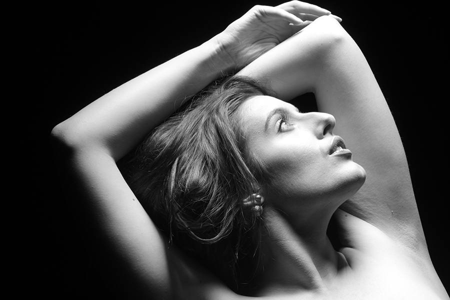
Portraits always seem to work better in black and white, like this studio photograph of Arabella. Have a look at Best Portrait Photographers for some more examples – there are one or two colour photos but the majority are in black and white. I’d add Robert Mapplethorpe to the list but be careful where you point that browser if you go looking for his work!

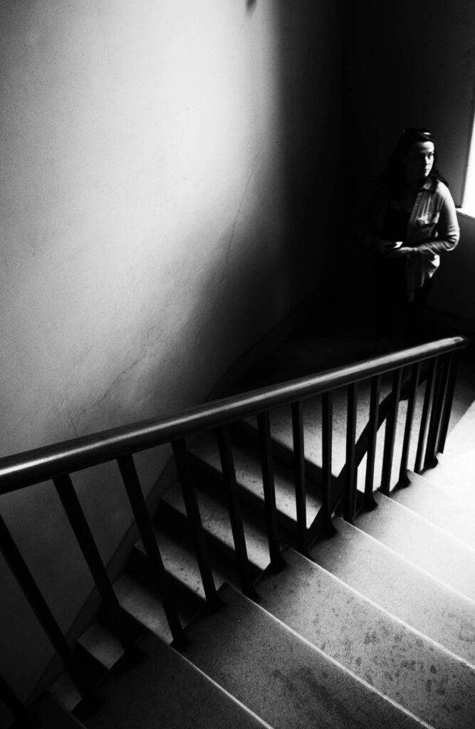
Here’s another one of mine, a personal favourite. This is my step-daughter Kate descending the stairs at Caulke Abbey. It’s the contrast between light and dark that make it for me.

Here’s Kate at Caulke Abbey again but this time I’ve accentuated the light. Most of these photos have had some adjustments made using Nik Silver Efex Pro, the software I consider to be the most essential to have for black and white photography. We nearly lost Nik when it was  acquired by Google in 2012 and development ceased.  However Nik Collection was acquired from Google by French software firm DxO in late 2017 and since then it has continued to be developed and improved.

Without darkness there is no light. Without light there is no darkness