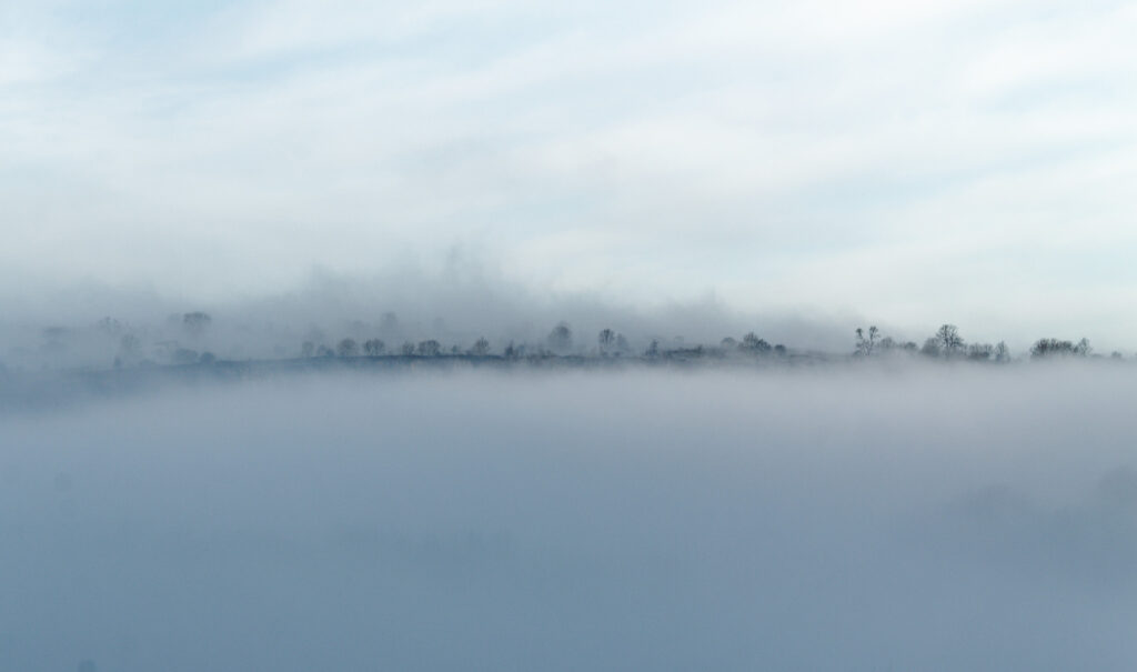
Defining minimalism in photography is difficult although some general rules of thumb can be stated, such as have a simple subject, use lots of negative space, ensure distance between yourself and your subject. However people can be very picky about what can be labelled minimalist. Try posting on minimalist groups on flickr for instance and you’ll soon come across people who’ll tell you that you’re doing it wrong.
I’d argue that my photo at the top if this post is a minimalist photograph. However, is the next photograph minimalist or not?
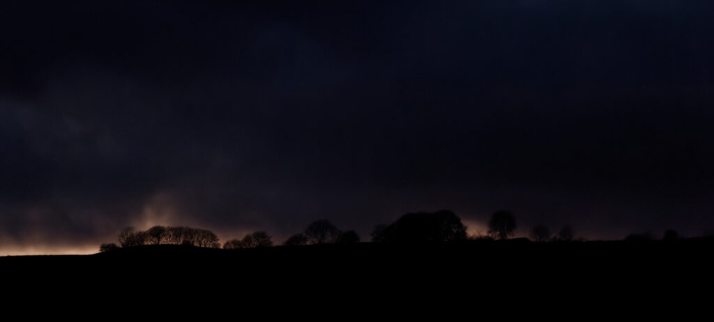
It’s the same place (I’m obsessed with the ridge opposite my home) and it certainly uses lots of negative space but some would argue (and have argued) that this is a landscape photograph but not minimalist.
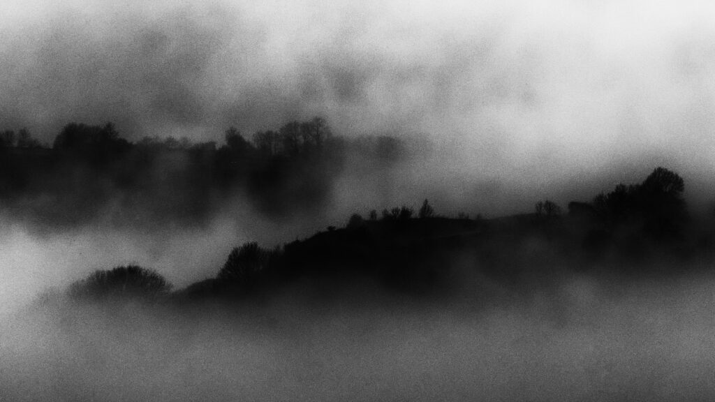
Again my camera is pointing in the same direction but zoomed in. Is this a minimalist photo or an abstract photo or another landscape?
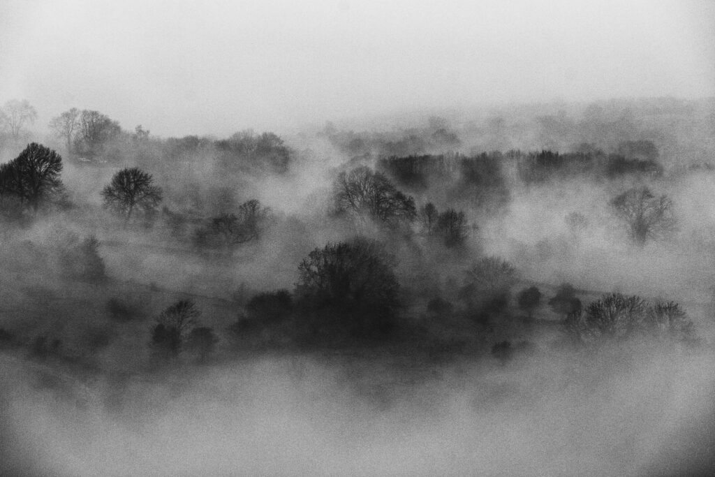
Ask yourself the same questions about the photograph above.
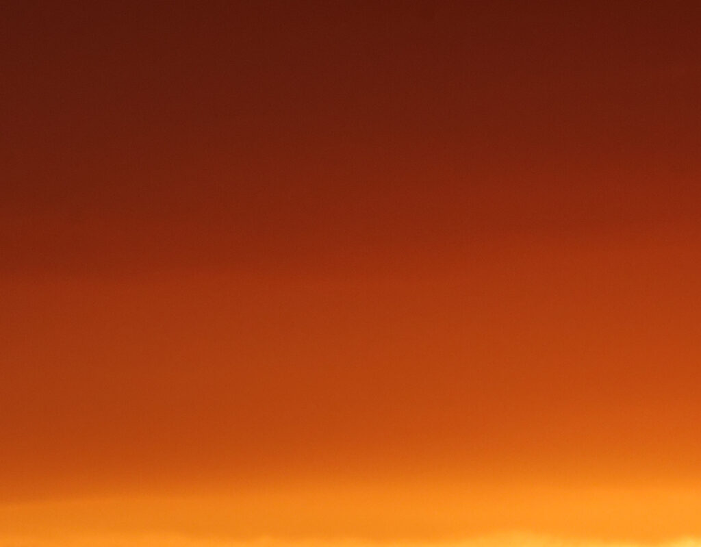
I’m still looking in the same direction but pointing the camera at the sky to achieve this Rothko-esque image. I’ve not done any post production on this photograph, it’s exactly as it was taken.
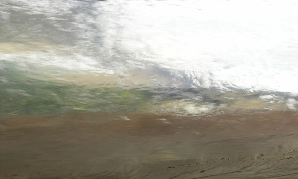
This one’s water flowing over metal at Yorkshire Sculpture Park.
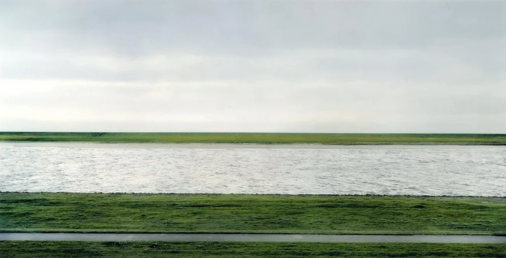
And finally take a look at Rhine II by Andreas Gursky which sold at auction for over 4 million dollars and this photo was edited to take out a factory and dog walkers!
